Igloo Software • Lead UX Designer • 7 min
Making Page Creation Usable at Scale
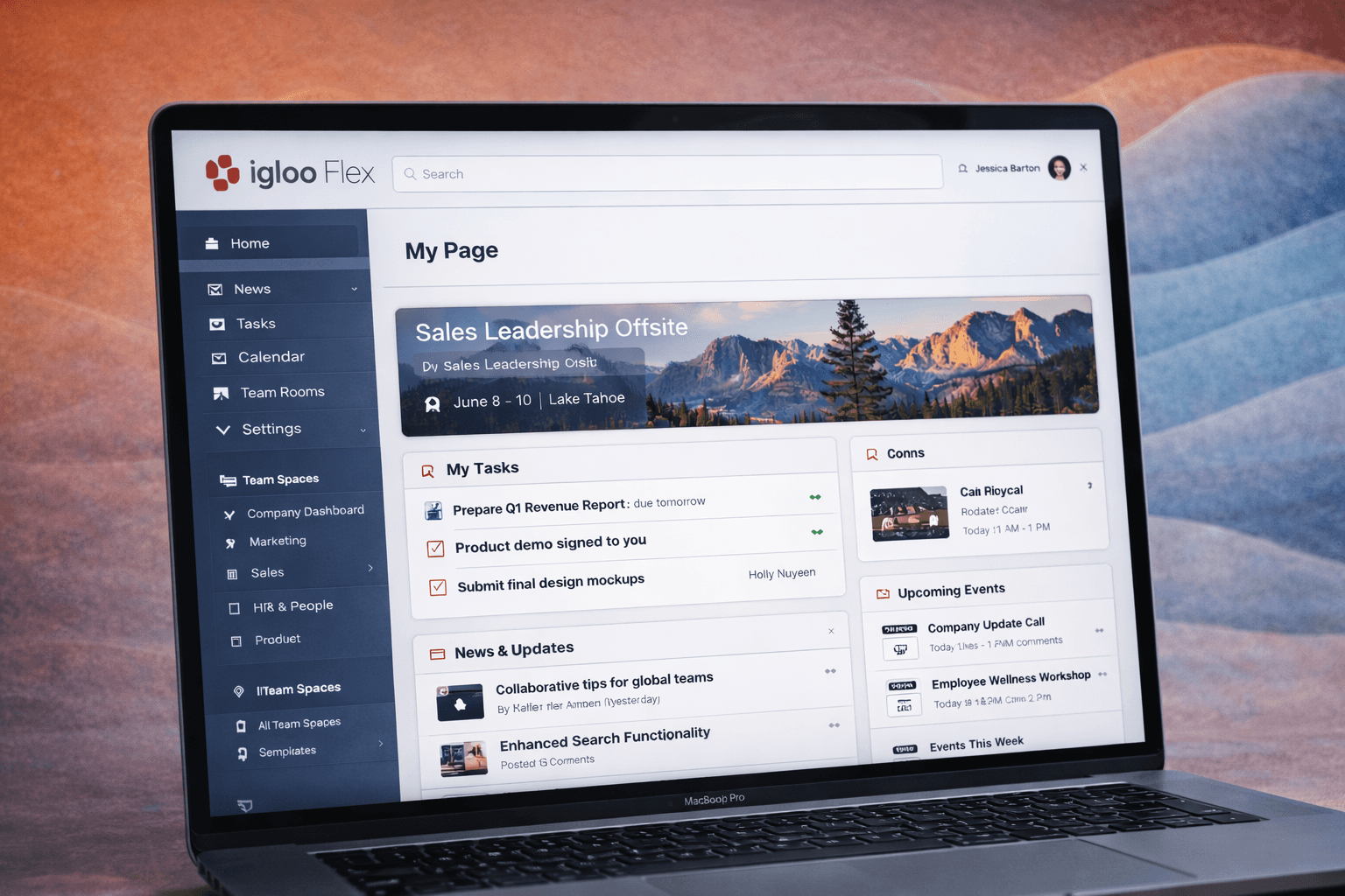
Confidentiality notice
This work is from my time at Igloo Software. I’ve generalized customer data and internal details so the focus stays on the platform, the system and the results.
Challenge
The Classic Page Builder was inconsistent and hard to use. Building a page took trial and error, and non-technical users struggled to get layouts they could rely on.
Strategy
Instead of patching an open-ended tool, we designed a structured system of shared patterns, templates and components, so building a page was more predictable.
Results
Page creation got faster and more consistent. Non-technical users could build with confidence, and pages stayed consistent across the platform.
Challenge
Fixing a page builder people had to fight with
The original Page Builder in Igloo Classic was never really designed as a product feature. It worked, but it depended on trial and error, inconsistent behaviour and loosely defined patterns.
The people building pages were usually communications managers or IT leads, not designers. They had very little guidance, so it was hard to understand layout, where things should go and how components worked together.
Even simple pages took experimenting. Results varied a lot depending on who built them.
As more customers moved to Flex, that wasn’t going to hold up. Page creation needed to become something non-technical people could rely on.
Strategy
Designing a system, not just a builder
We stopped thinking of this as fixing a tool and started defining how page creation should work across the whole platform.
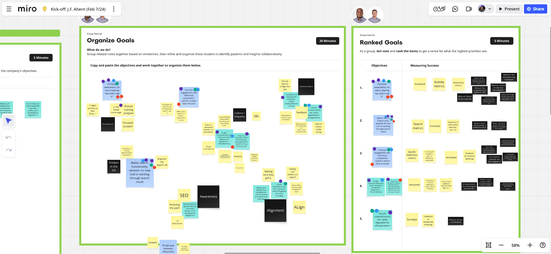
Agreeing on the problem
Before designing anything, I worked with Product and Engineering to agree on scope and constraints. We started with a few blunt questions:
What happens if we do nothing?
What’s the smallest improvement that would actually help?
Should more than one builder model exist at the same time?
How much flexibility is worth the extra engineering complexity?
Answering those first meant we were solving the right problem before we committed to a direction.

Understand
Understanding real usage
Next we looked at how organizations were actually setting up their intranets. The same kinds of pages kept showing up:
Department hubs
News and announcement pages
Resource directories
Team collaboration spaces
Most people weren’t building something unique each time. They were rebuilding familiar structures over and over.

Exploration
Exploring solutions
We looked at a range of options, from small UI fixes to more structured models. It became clear that the interface wasn’t the real issue. The builder had to handle all of these together:
Page structure
Layout consistency
Widget configuration
Templates
Branding and theming
Polishing individual interactions wouldn’t have fixed the complexity underneath.
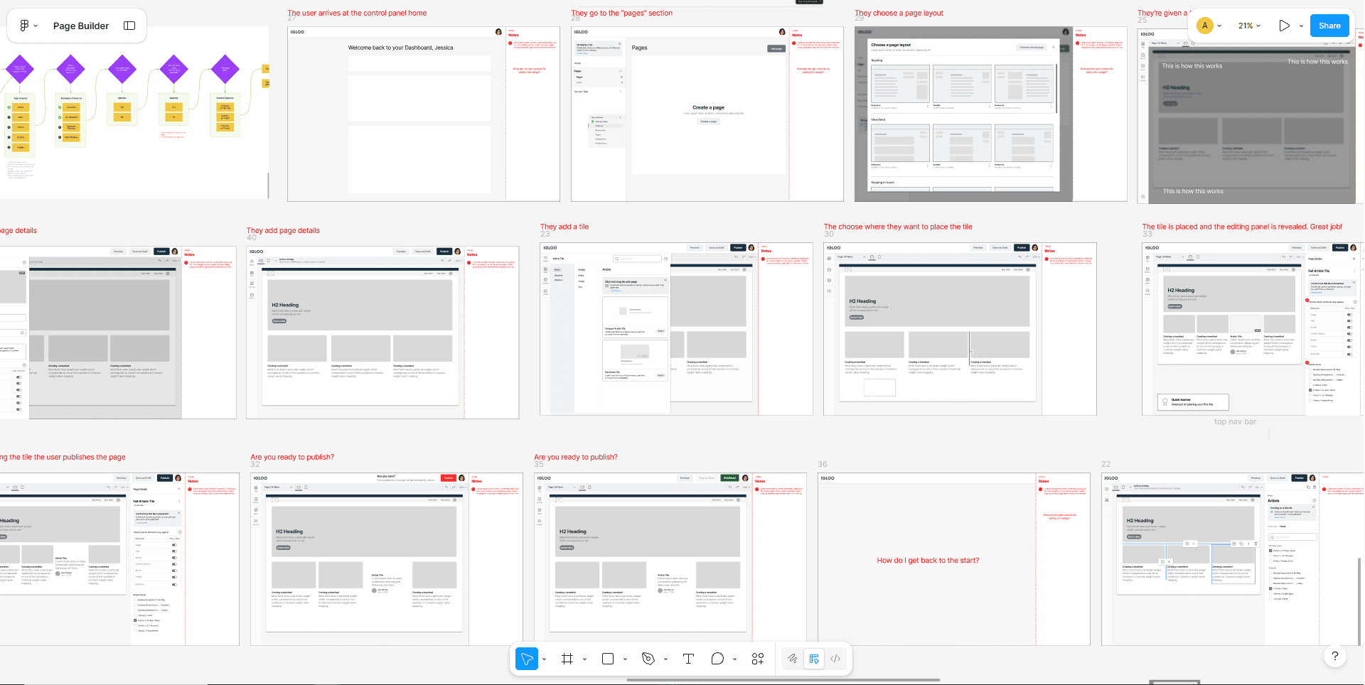
Definition
Defining the system
So we moved from open-ended creation to a structured configuration model. It introduced:
Structured components: Reusable building blocks with defined behaviour and layout rules
Templates: Starting points based on the common page types we found
Global styling: Central controls to keep pages on brand
Inline guidance: Help right where people needed it, so they weren’t guessing
That took away most of the guesswork while keeping flexibility where it mattered.
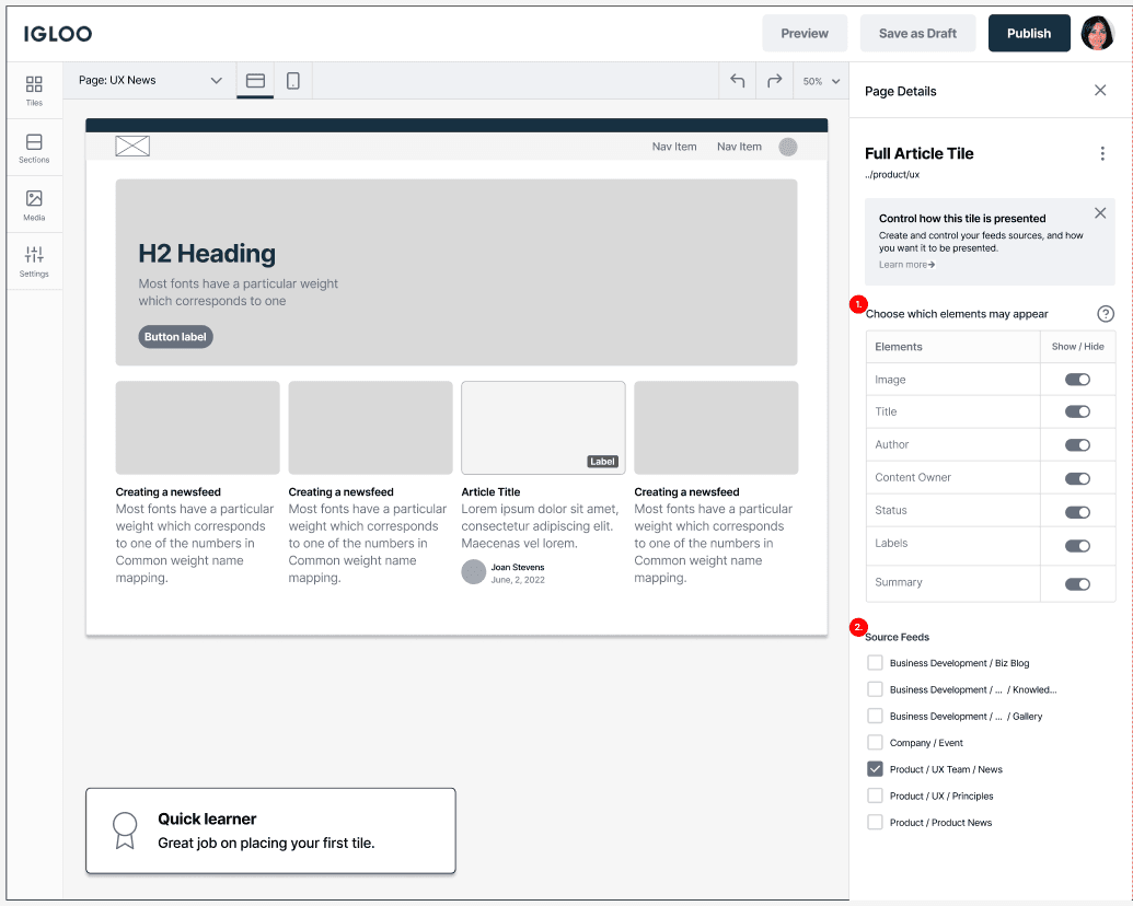
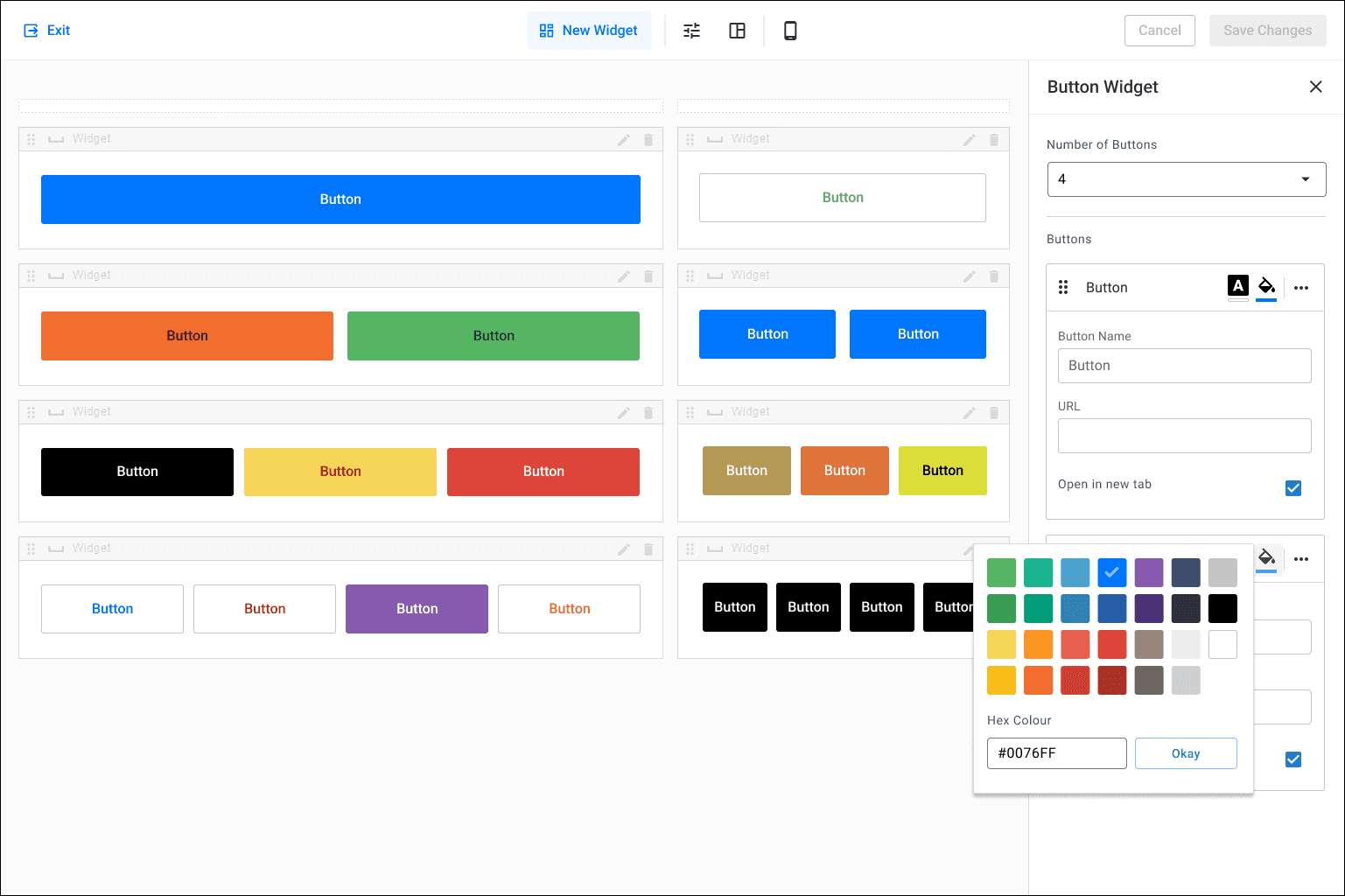
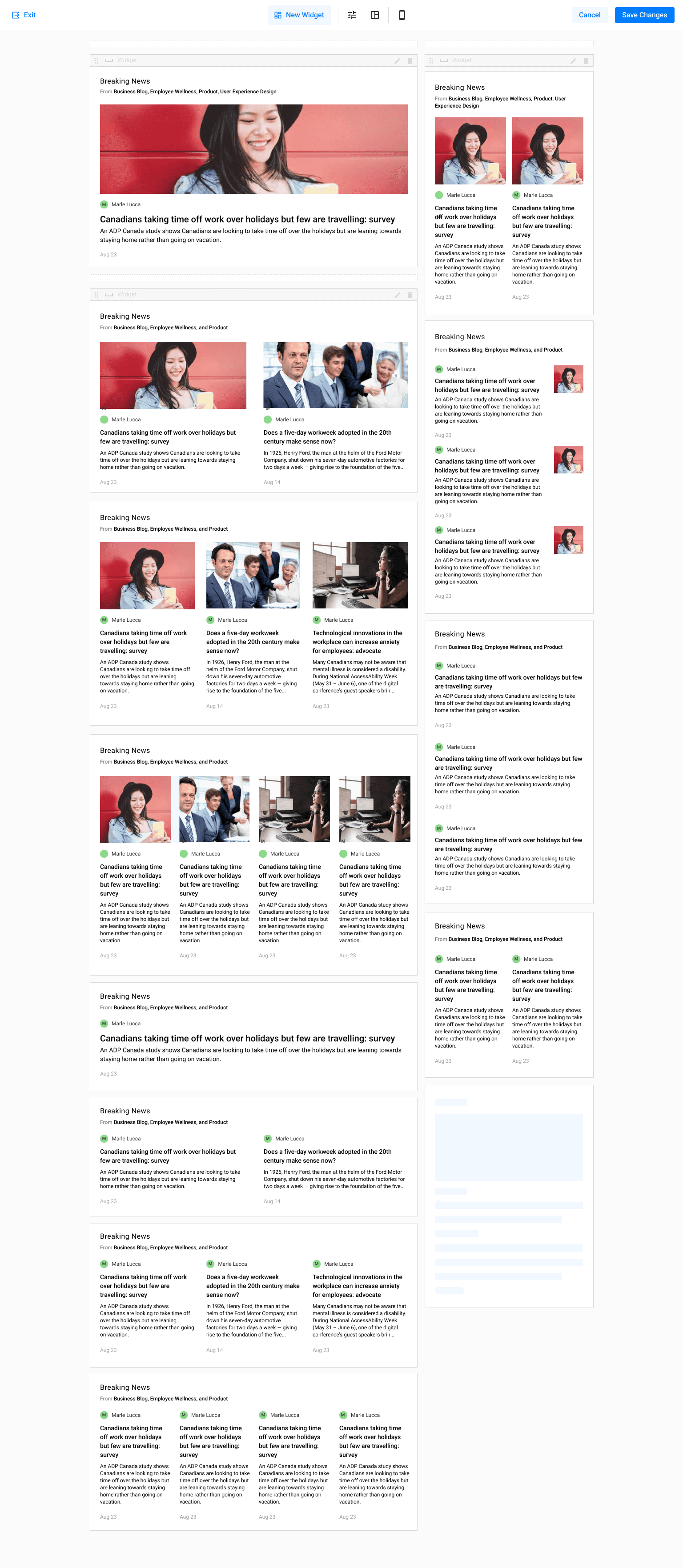
Shared components and layouts replaced one-off designs,
so pages stayed consistent as the platform grew.
Scaling
Scaling across teams
As the system matured, my role grew into leading UX across teams. I worked with feature teams to:
Make sure new components fit the design system
Keep workflows consistent
Run design reviews and get people to agree on the work
Stop new one-off solutions from creeping back in
That kept the Page Builder growing as part of the platform instead of drifting off on its own.
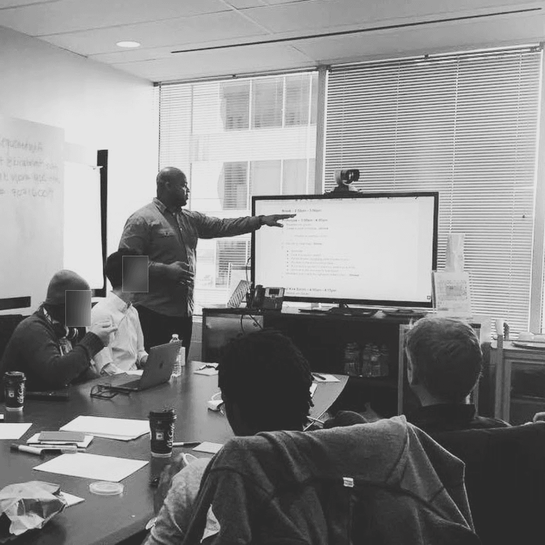
As the system grew, I worked across teams
to keep the quality and consistency up.
Results
Page creation people could rely on
The Page Builder went from a fragile tool to a core part of Igloo Flex.
Admins could build pages without design experience. Components and templates cut out most of the trial and error, so building a page was faster and more predictable.
Shared patterns replaced one-off layouts, so pages looked and worked consistently across customer environments, and that held as the platform grew.
Page creation got easier, and it scaled with the platform.
Engagement
48%
Increased engagement by 48% through clearer structure and easier discovery
Efficiency
30%
Cut deal-blocking product issues and the time spent helping customers get set up, both by 30%
Adoption
20%+
20%+ higher user adoption than Classic within 60 days of onboarding
Lessons
Balancing flexibility and structure
The hard part of a page builder is deciding how much freedom to give people.
Templates built from what customers were already making did more than extra layout options would have. Since most admins were rebuilding the same few page types, giving them a good starting point mattered more than giving them a blank canvas.
Asking “what happens if we do nothing?” at the start kept scope honest. It forced us to name the real cost of the old builder before anyone argued for a bigger solution.
Help works best inside the task. Inline guidance in the builder was more useful to communications managers and IT leads than anything they’d have had to go and look up.
The structure needed someone protecting it. Once other teams started adding components, design reviews were what kept the system from turning back into the old builder.
Igloo Software • Manager of UX • 7 min
Igloo Software • Manager of UX • 5 min